Day-to-Day

Films and Sound: an Unbalanced Relationship

March 21, 2016

Modern cinema follows a strict set of rules, a long preestablished language composed of conventions and agreements employed and accepted respectively by both the filmmakers and the audience. For example, when we see a close up of a character’s face followed by another close up of his or her hands tightly clasped, we understand that character is trying to hide emotions from another character who is looking at them, but he or she can’t hide it from the filmmaker’s gaze. We do not think that the first close up is a body-less head, nor that the second is a pair of chopped hands, but creating this meaning for the audience - that these shots were clues given by the filmmaker on the inner workings of said character by showing contrasting emotions expressed through their bodies – was something that took years to perfect. The same way these conventions are valid for the images (framing, lighting, movement), sound also has its own language. The first movies had no sound the same way that the first recordings had no images; these were separate mediums and their merging is what truly represents cinema. With the passing of time, filmmakers’ use of sound evolved into different meanings other than plainly representing what is being shown on screen. Sound can heighten or even completely inverse our perception of images. If a movie’s sound just portrays the obvious, its filmmaker is missing out on great opportunities to add depth and meaning to the story.

Cinema can’t exist without images – that’s obvious – the same way it can’t exist without sound. At first this might sound a little daunting since, for a long time, films were silent. Silent, yes, but not completely devoid of sound. Michel Chion is a French music composer and professor of audio-visual relationships at the University of Paris. He is a theoretician that thinks very closely to Walter Murch’s ideas (Chion dedicated his book Film, a Sound Art to Murch and Murch wrote the preface for the translation of Chion’s Audio-Vision); Chion states that “the suggestion of sound was in the air at the time. . . . In the silent cinema, instead of sound for sound, spectators were given an image for a sound: the image of a bell suggests the sound of a bell” (Film, a Sound Art, 5), and even the exaggerated gestures meant to translate as what the characters were saying so the audience could follow along and not assume all characters are communicating telepathically. In the very early ages, films such as Edwin S. Porter’s would have a commentator by the screen, narrating what was going on. Later on, this person was replaced by intertitle cards that would directly represent dialogue and bind together what would seem disconnected sequences. Even though we call them silent films, the silence of a movie theater has always been filled with music, at first any music would do, then there was music composed to be played specifically with the movie, and after that, there would be a kind of sound effect layer added to certain elements on the screen that could be represented by musical instruments for example cannon fire cued a drum in the theatre (Film, a Sound Art, “When Film was Deaf”).

Seeing this fundamental connection, several people tried to blend both things. Thomas Edison had both moving-picture and sound apparatuses by the end of the 17th century. The Phonograph was a device that could reproduce sounds recorded on a wax cylinder. The Kinetograph was Edison’s moving-picture camera and it came associated with the Kinetoscope, a one-man booth where the user could watch a short clip projected in a loop. The main person behind the Kinetoscope research and development was William Kennedy Laurie Dickinson, one of Edison’s employees. The first record of sound and image recorded together is Dickinson Experimental Sound Film: a clip, shorter than 20 seconds, of a man playing a violin in front of a recording Phonograph while two other men dance in front of the camera. These two elements (image and sound) were not synchronized until recently, by no one less than Walter Murch. “It was very moving, when the sound finally fell into synch: the scratchiness of the image and the sound dissolved away and you felt the immediate presence of these young men playing around with a fast-emerging technology.” (Murch, Filmsound.org)

The main difference between the results achieved by Murch and what the audience saw and heard at the Kinetophones (the resulting mix of the Kinetoscope and the Phonograph) back in the early 1900s was that the Kinetophones had no synchronizing mechanism. The images would play on their own, and so would sound, each of them from a different platform, so getting the starting point to match precisely was nearly, if not completely, impossible. It wouldn’t be for another two decades until synch could be completely achieved, by Lee De Forest, an American inventor who managed to record sound on an optical track directly on film. All previous attempts relied on having separate devices – film for the image and discs, cylinders or tubes for the sound - and the main problem hinged on starting at the same time and remaining in sync for the duration of the show. The transition from silent films into talking pictures is wonderfully depicted in Singing in the Rain, a 1952 film directed by Stanley Donen and Gene Kelly. In one of the scenes, the cast and crew is watching the premiere of the film along with the audience and we get plenty of examples of all the awkwardness that was introduced by having synchronized sound, including one of the most memorable examples of how out-of-sync sound and image might change completely the meaning of a scene.

Live-recorded sound didn’t have its place secured under the sun until late 1927, with the release of The Jazz Singer. Until then, talking pictures were still considered a fad and expected to bore the audience soon enough. The difference between other sound films and The Jazz Singer is that the latter had not only music accompanying the film, but also two very brief excerpts of live-recorded audio in sync with the film. That drove audiences wild and the movie’s box-office through the roof. From that moment on, for purely economic reasons, talking pictures were here to stay. The Warner Bros hit was sounded with the use of the Vitaphone – which was still a dual system: the sound played from a disc, not straight from the film. According to Michel Chion, the main problem that came with the definitive establishment of sound in movies is “the Vitaphone process was perceived . . . as an improvement, not a revolution” (Film, A Sound Art, 34). The audience’s approval of spoken lines was also a trap for films since speech prevailed as the main element of sound in films for good fifteen years, from 1935 to 1950, as presented by Chion, either through dialogue or voice overs. Filmmakers chose to make films verbocentric as that was the easiest way to please the audience and the producers at the same time, which led to having the sound design aspect of movies not as developed as, for example, the visual aspect (Film, a Sound Art, 73).

From 1927 onwards, the technological aspect of sound recording and playback as well as techniques for capturing, editing and mixing it improved vastly to what we hear at the theatres today. What didn’t change so much was the filmmakers and studios’ perception that

“Sound has an “added value, . . ., [an] expressive and informative value with which a sound enriches a given image so as to create the definite impression, . . . that this information or expression ‘naturally’ comes from what is seen, and is already contained in the image itself. Added value is what gives the (eminently incorrect) impression that sound is unnecessary, that sound merely duplicates a meaning which in reality it brings about, either all on its own or by discrepancies between it and the image.

The phenomenon of added value is especially at work in the case of sound/image synchronism, via the principle of synchresis” (Chion, Audio-Vision, 5)

Synchresis is Chion’s concept of connecting the words “synchronization” and “synthesis”, it is the thought process that binds together an image and a sound which are perceived at the same time (Audio-Vision, 63). For example, if we see a gun firing and we hear the sound of a whistle, we automatically bind these two together without as much as questioning how they are connected. “Synchresis is what makes dubbing, postsynchronization, and sound-effects mixing possible” (63) and this is the ultimate tool to re-signify the role of sound.

In his book about editing, In The Blink of an Eye, Murch talks about the difference between good and bad sound mixes, but his words also apply to the general use of sound: “[i]t depends on . . . how capable the blend of those sounds was of exciting emotions hidden in the hearts of the audience. . . Past a certain point, the more effort you put into wealth of detail, the more you encourage the audience to become spectators rather than participants” (15). When the audience becomes spectators, they stop thinking about the sound’s meanings and take it as a very detailed representation of what their eyes are absorbing, with no unique storytelling features but an empty attempt at immersion (Magalhães, 10). A few examples of this concept of excessive sounds are most action blockbuster released in the past few years, namely, any of Michael Bay’s Transformers movies: our ears are filled with small gears and engines and switching and pumping and nuts bolts to add realism to ludicrous robots, but in the end seeing those sequences without sound would not change the story even a little bit.

Back in 1929, René Clair – a French movie critic – raised the point that “[t]he visual world at the birth of the cinema seemed to hold immeasurably richer promise. . . . However, if imitation of real noises seems limited and disappointing, it is possible that an interpretation of noises may have more of a future in it” (93).  It is quite worrisome that this is almost the same issue brought up by Chion in 1994: “[r]evaluating the role of sound in film history and according it its true importance is not purely a critical or historical enterprise. The future of the cinema is at stake. It can be better and livelier if it can learn something valuable from its own past” (Audio-Vision, 142). The challenges are not dictated by technological limitations as they were in the beginning of the 20th century, the challenge now is how to not succumb to the common pitfall of using sound as a mere echo of the image or focusing exclusively on dialogue to explain every event that could have been explained differently. Fortunately there’s hope: the number of movies (or TV shows) where sound plays a role as important as image has been growing and it’s not hard to come up with a few names such as Barton Fink, No Country for Old Men, Breaking Bad, Apocalypse Now and The Conversation. An increasing title count does not solve the matter, though. In order to reduce this gap between sound and image, the teaching of how to make films has to go through some changes, from scriptwriting to directing, from shooting to editing, sound can’t be something that is just used to fill any awkward silence. Proper sound, with meaning, has to be planned and conceived from the earliest stages of a film.


Works cited

Chion, Michel. “Audio-Vision: Sound on Screen”. New York: Columbia University Press, 1994. Print

Chion, Michel. “Film, a Sound Art”. New York: Columbia University Press, 2009. Print.

Clair, René. "The Art of Sound." (1929) Film Sound: Theory and Practice. Ed. Elisabeth Weis, John Belton. New York: Columbia University Press, 1985. 92-95. Print.

Dickinson Experimental Sound Film. Dir. William Dickinson. Edison Manufacturing Company. 1895. Web. 13 Mar 2016

Magalhães, Mayara. “O Som Escrito”. São Paulo: Universidade de São Paulo, 2014. Web. 13 Mar 2016.

Murch, Walter. “Dickson Experimental Sound Film 1895”. Filmsound.org (2000). Web. 19 Mar 2016

Murch, Walter. “In the Blink of an Eye”. 2nd Ed. Los Angeles: Silman-James Press, 2001. Print.

Singing in the Rain. Dir. Gene Kelly and Stanley Donen. Perf. Gene Kelly, Donald O’Connor and Debbie Reynolds. MGM. 1952. Film.
Anamorphic

Anamorphic Chop Shop - Cropping in Post

March 20, 2016

Continuing the Chop Shop series on post-processing, I'll explain how to properly crop your footage and do digital pans in case you have resolution to spare!

USEFUL LINKS:

All the RED links on this post are part of eBay's Partner Network, so if you purchase anything through them, you're helping me to keep this project going.
You can support this project on Patreon. Make your contribution and help the Anamorphic Cookbook!

Tito Ferradans here for another post-processing Chop Shop. I received some questions about cropping in post - which is a necessary tool if your camera only shoots 16:9 and you want full control over your final aspect ratio. I'll go over After Effects and Premiere, which are the ones I use on my daily life, but I'm pretty sure the idea translates over to any other editing/compositing software.

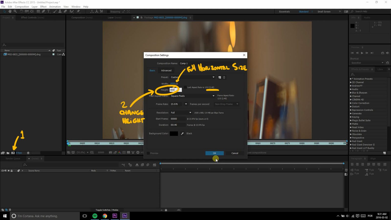
Building up on the previous video (aspect ratio), load up After Effects, import your footage and apply the proper stretch - check the tutorial if you're not sure how to do that. Then create your composition with the desired aspect ratio - to find the proper height, divide the horizontal resolution by the aspect ratio.

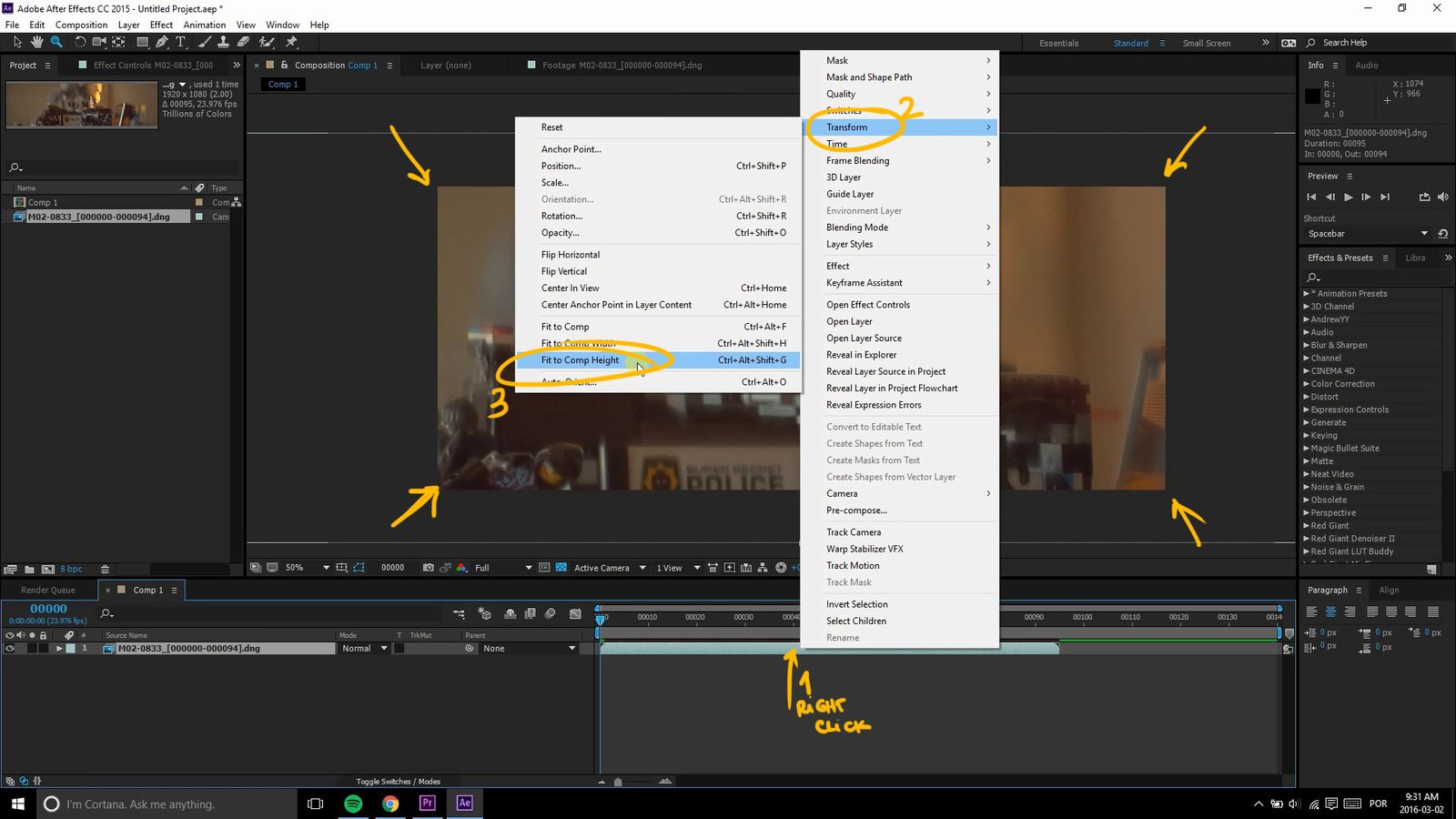
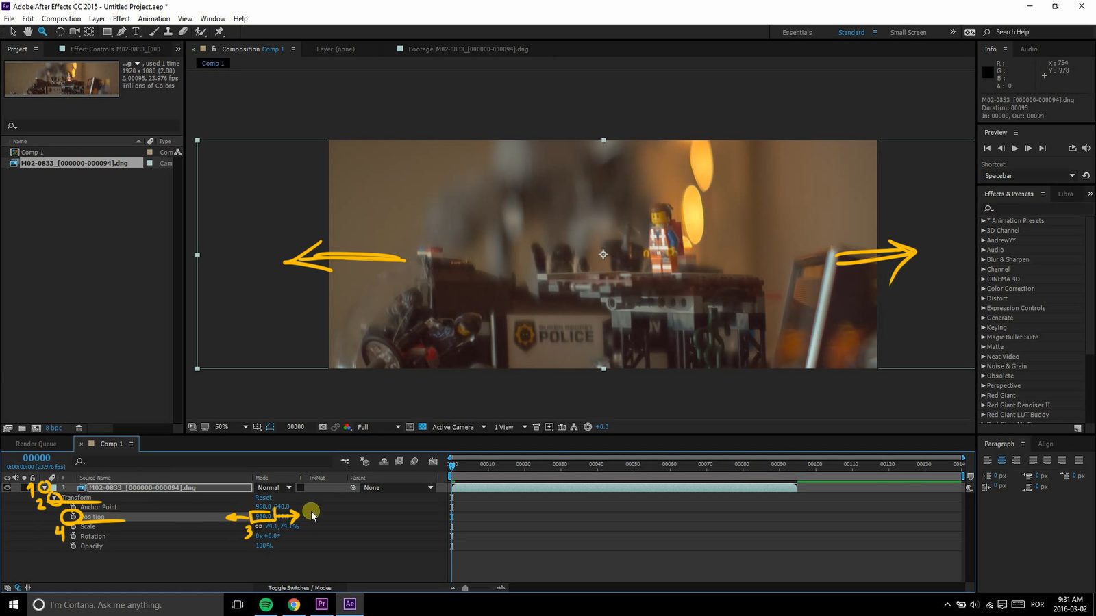
Now drag the footage over to the composition, right click its layer and select "Fit to Comp Height" and voila! The coolest thing about this method is you can use the horizontal position attribute and keyframes to create digital pans and adjust the framing as you please!


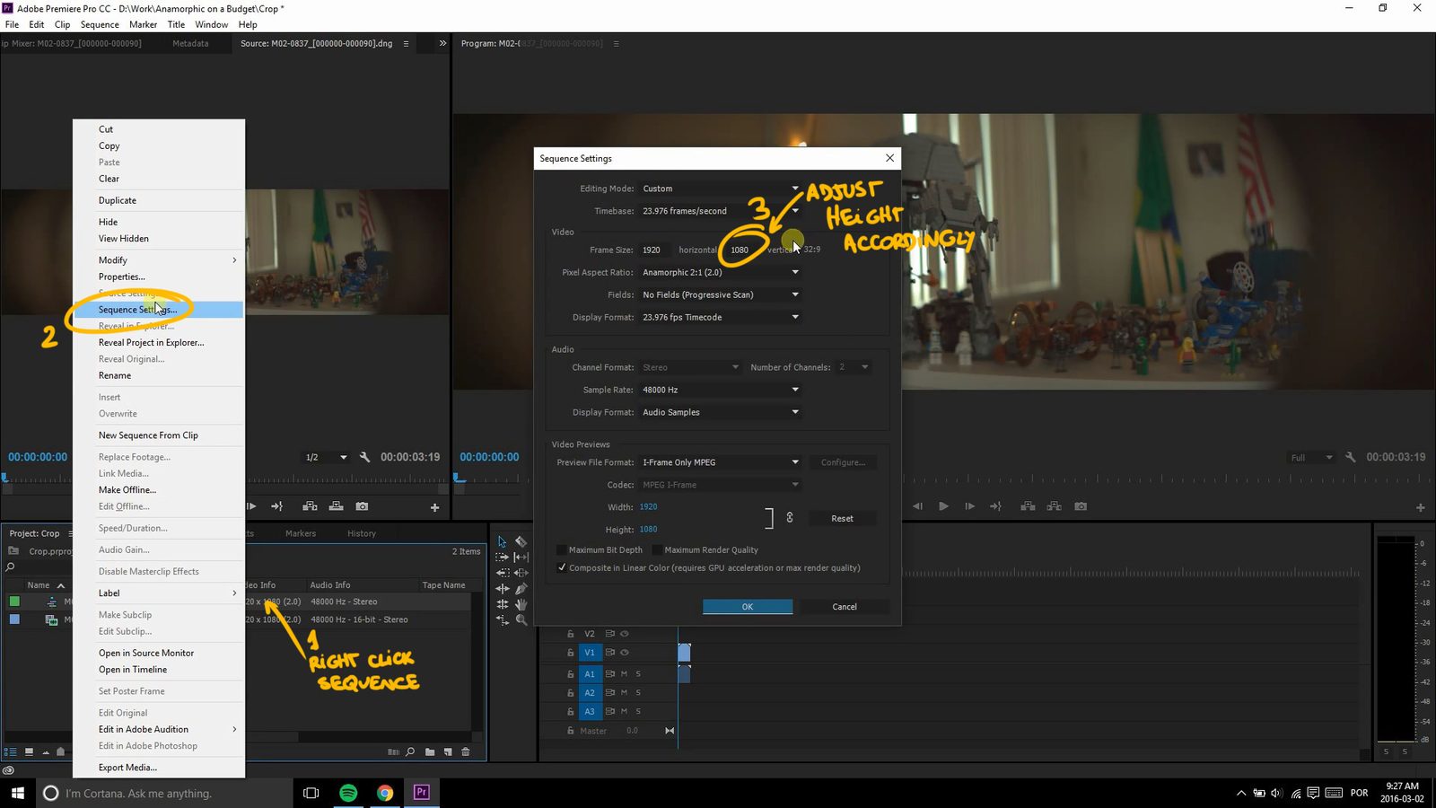
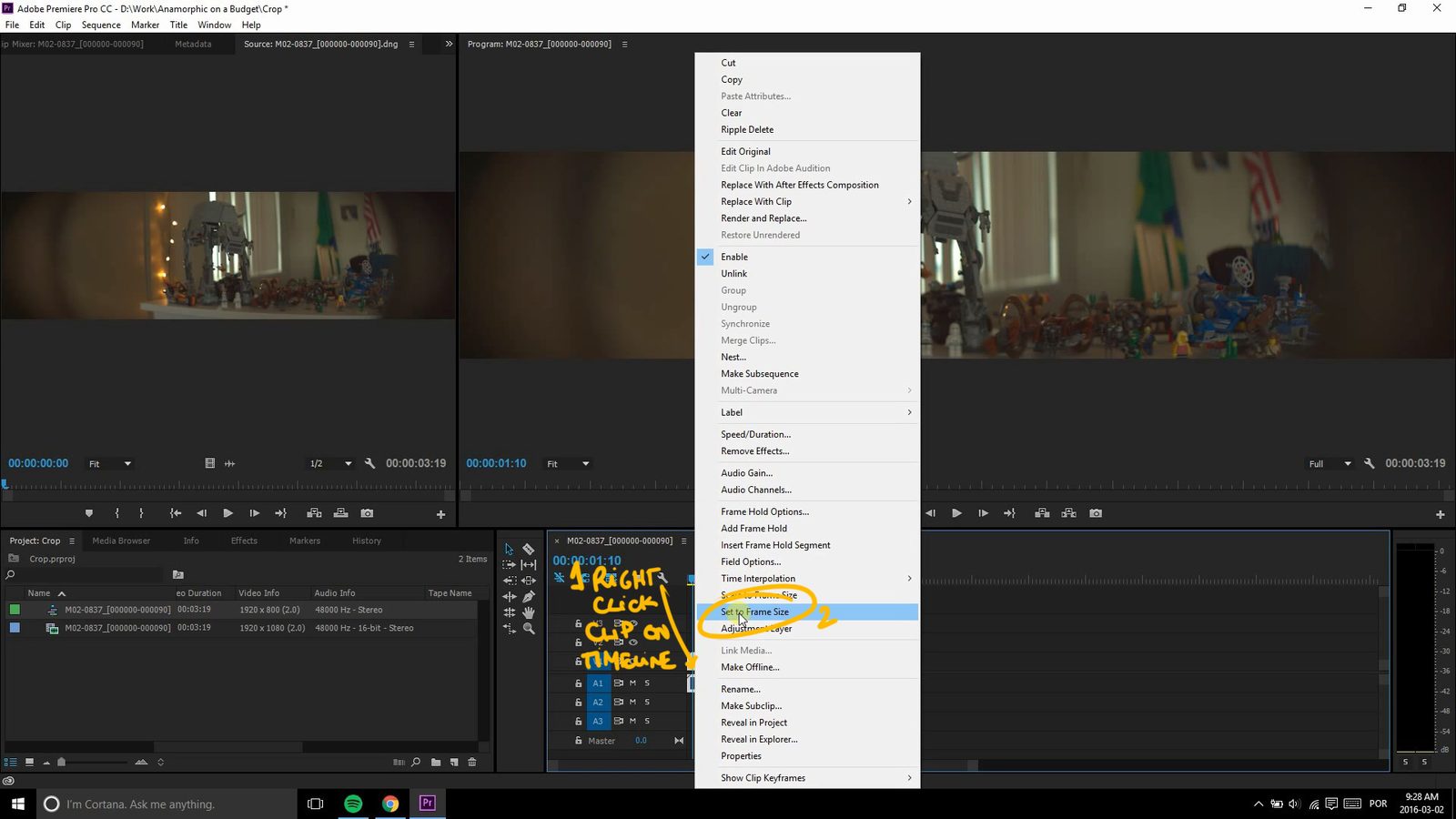
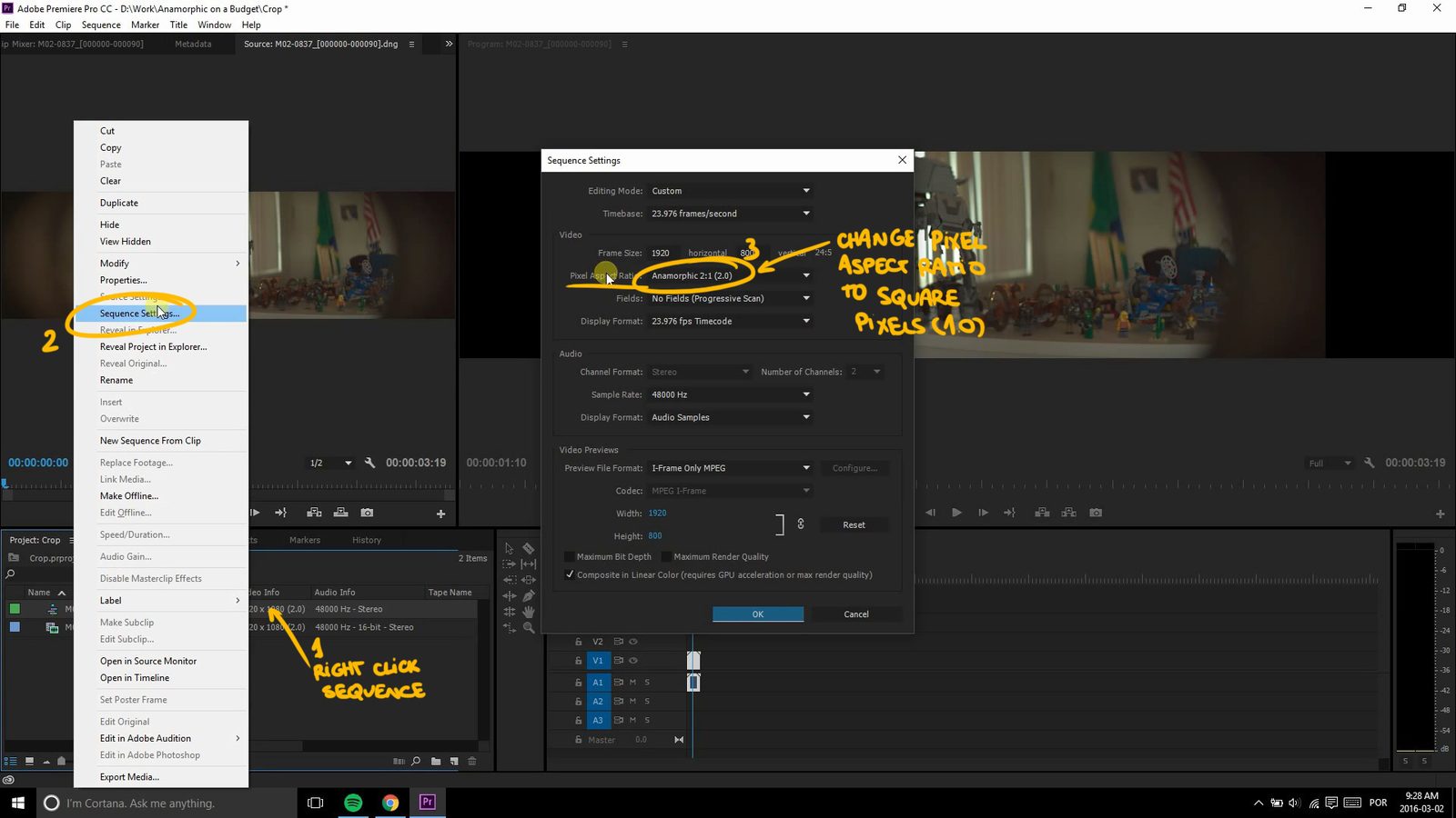
In Premiere, the process is quite similar but with a few more steps. Import your footage, apply the stretch and then drag it to a new sequence. Now right click the sequence on the Project tab and select "Sequence Settings". Here you'll change both the height based on your project's output. As I'm doing HD, I'll just input 1920 by 800. Now the clip is too tall, so right click on it in the sequence and select "Set to Frame Size". That will adjust the dimension of the clip so it fits properly, now move back to the Project tab and right click on the Sequence again, since it's still super wide. On the Pixel Aspect Ratio dropdown, select Square Pixels (1.0).


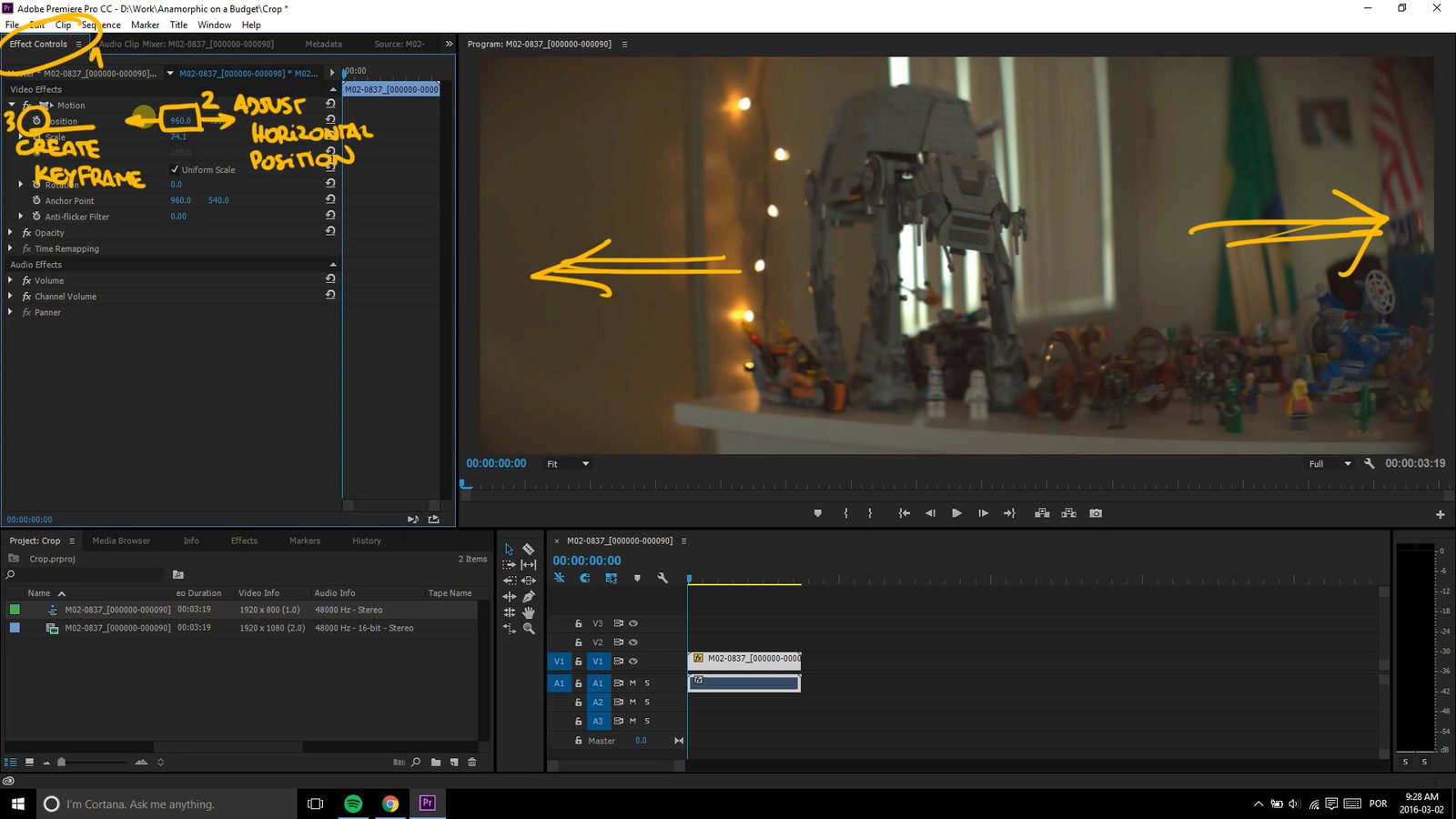
You can do the digital pan in Premiere too, but it's a less friendly process. On the Effects tab, under Motion, adjust the horizontal position to the initial point, create a keyframe by clicking on the little stopwatch, then move on the timeline to the point when you want the pan to end, and adjust the horizontal position to its final... position and Premiere automatically creates a keyframe there.

There you go, a few simple steps to control your final aspect ratio. I hope you found this tutorial useful, let me know what you think in the comments section. Subscribe to the channel for the upcoming videos and head on to the blog for the Anamorphic on a Budget guide and lots of cool stuff such as the Anamorphic Calculator and the pitch for the Anamorphic Cookbook! I also have an awesome t-shirt in the works, so grab yours now before the stock runs out. Ferradans out.

Anamorphic

Anamorphic Chop Shop - Proper Aspect Ratio

March 13, 2016

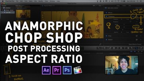
Addressing one of the most common questions out there, here's how to properly stretch your anamorphic shots using Adobe Premiere, After Effects, Photoshop and Final Cut Pro X.

USEFUL LINKS:

All the RED links on this post are part of eBay's Partner Network, so if you purchase anything through them, you're helping me to keep this project going.

You can support this project on Patreon. Make your contribution and help the Anamorphic Cookbook!

Tito Ferradans checking in, how's it going, anamorphic buddies? Here the Fall/Winter season continues, so today we have another post-processing chop shop. This is one of the most common questions I see around the web, from people who are just starting into this distorted reality that we love. "How do I stretch the footage properly?". Well, there are several different methods. I'm gonna cover Premiere, After Effects, Photoshop, Final Cut Pro X - even though I hate it.

First, WHY do we need to stretch the footage? Well, the visual answer is pretty easy: "because things don't look as they should". Ok, and why is that? Because the anamorphic glass compresses the horizontal axis while keeping the vertical untouched. Good, so how much is that compression? The lens usually says and the most common values are 1.33x, 1.5x and 2x. There are a few odd 1.75x and other numbers out there, but once you get how to do it, the stretch doesn't matter much. So now we know that the image is compressed by 1.33x, 1.5x or 2x in the horizontal axis.

Let's trail off a bit. A pixel is the smallest area of an image, a tiny square with a unique color value. You noticed I used the word "square" just now, right? Nowadays most imaging resources (cameras and monitors) use a square ratio for resolution, which means that if you divide its height by width (or vice versa) you'll get 1 as the result. Back in the DV era, cameras played with this ratio. 4:3 footage had a 0.9 pixel aspect ratio, while widescreen (16:9) had a 1.21 pixel aspect ratio. The sensor size never changed, neither did the recorded image, but the pixel aspect ratio told the editing program to stretch or compress the HORIZONTAL axis by that value. Hmm, this is becoming kind of useful, isn't it?

Now we know that one can change a pixel's aspect ratio, making all of them shorter or longer, according to a specific value, than the recorded image. Well, it seems this is what we need with all that stretch-factor thing.

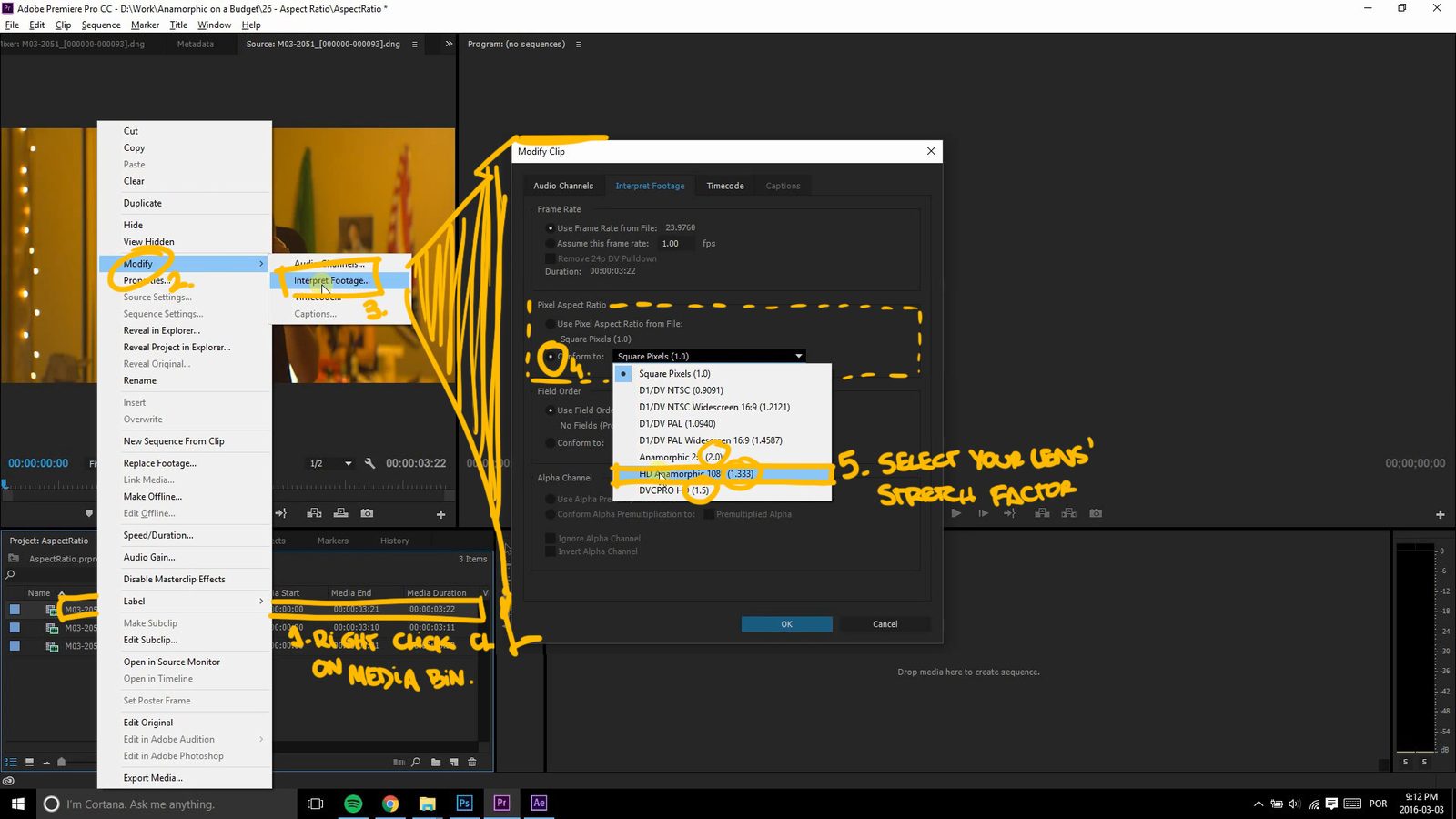
Starting with Premiere, import your footage and then right click on the file here in the Media Bin. From the menu, go to Modify, then Interpret Footage. A pop up will open and, look at that, there's a "Pixel Aspect Ratio" menu! There you just need to pick your lens' stretch and voilá, it's done, looking just like it should.

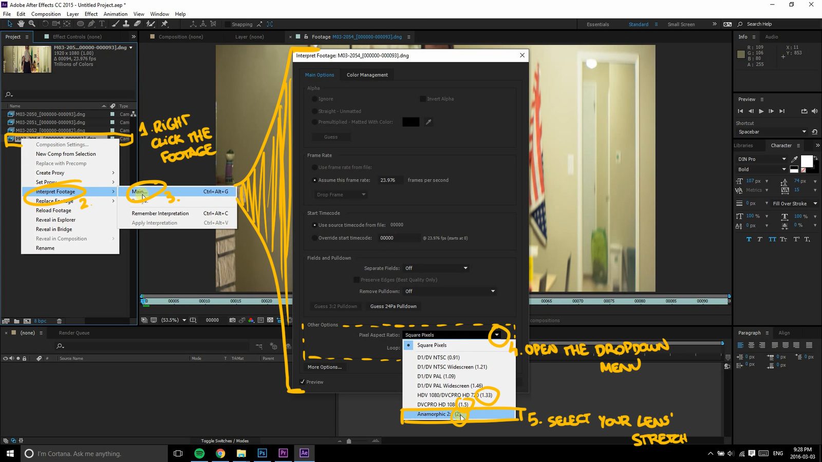
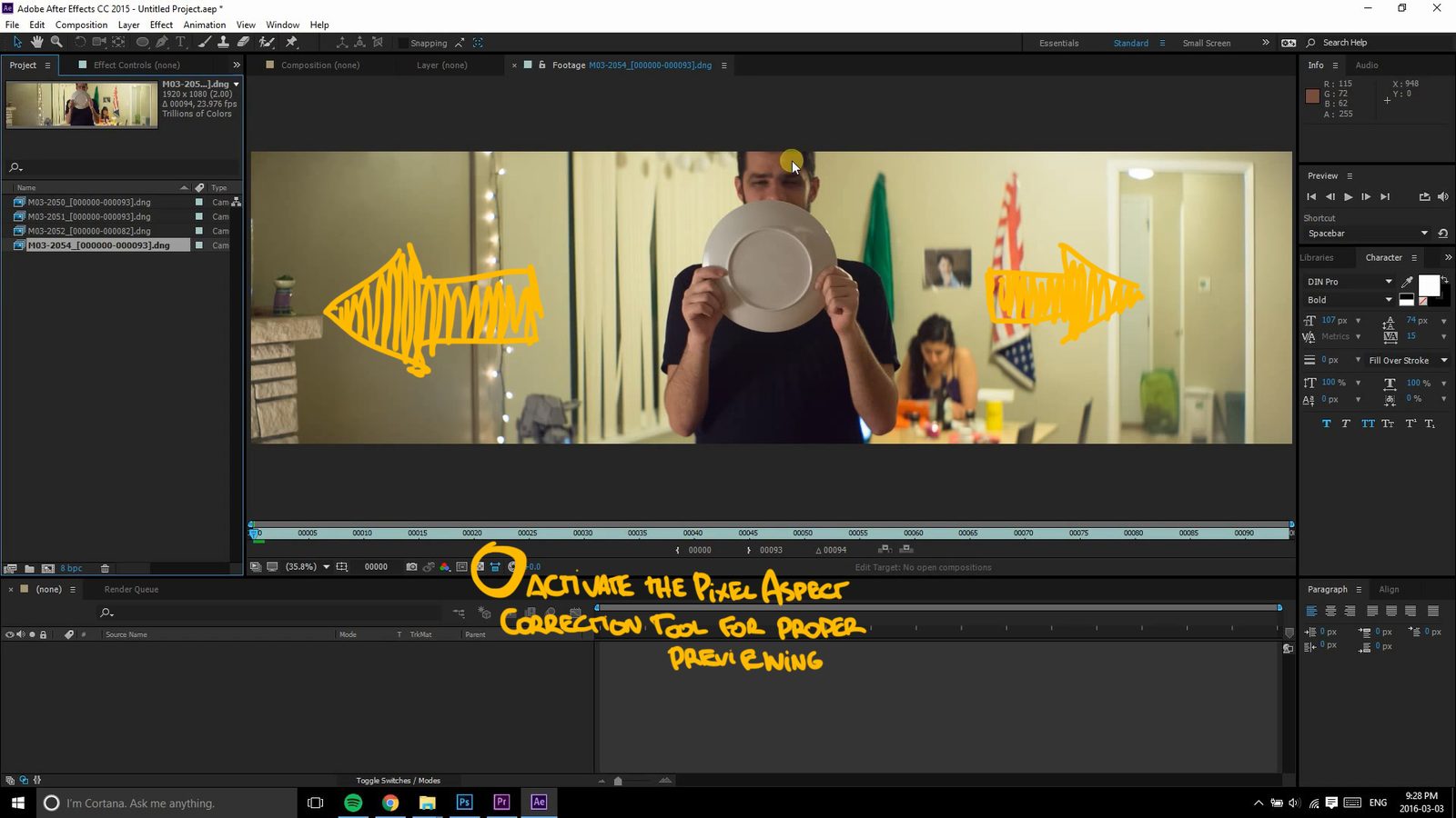
After Effects has a few different options. First, you can import your footage and do the same thing as Premiere: right click, "Interpret Footage", then "Main", and in "Other Options", change the "Pixel Aspect Ratio". To preview this change, enable the Pixel Aspect Ratio correction on the viewer by clicking this icon.


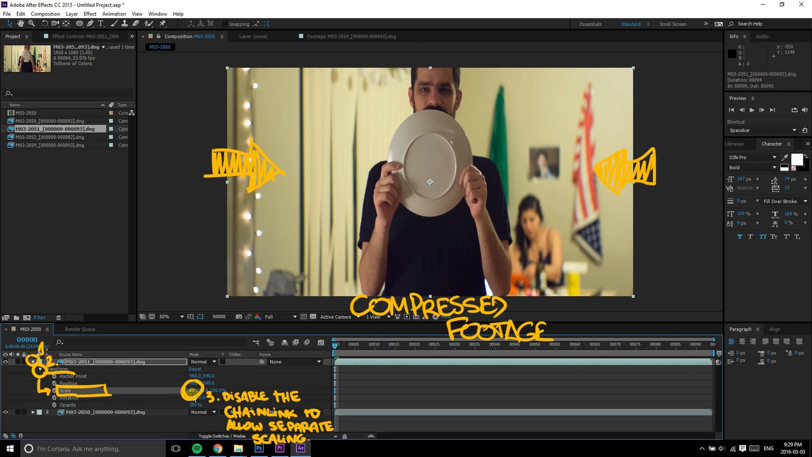
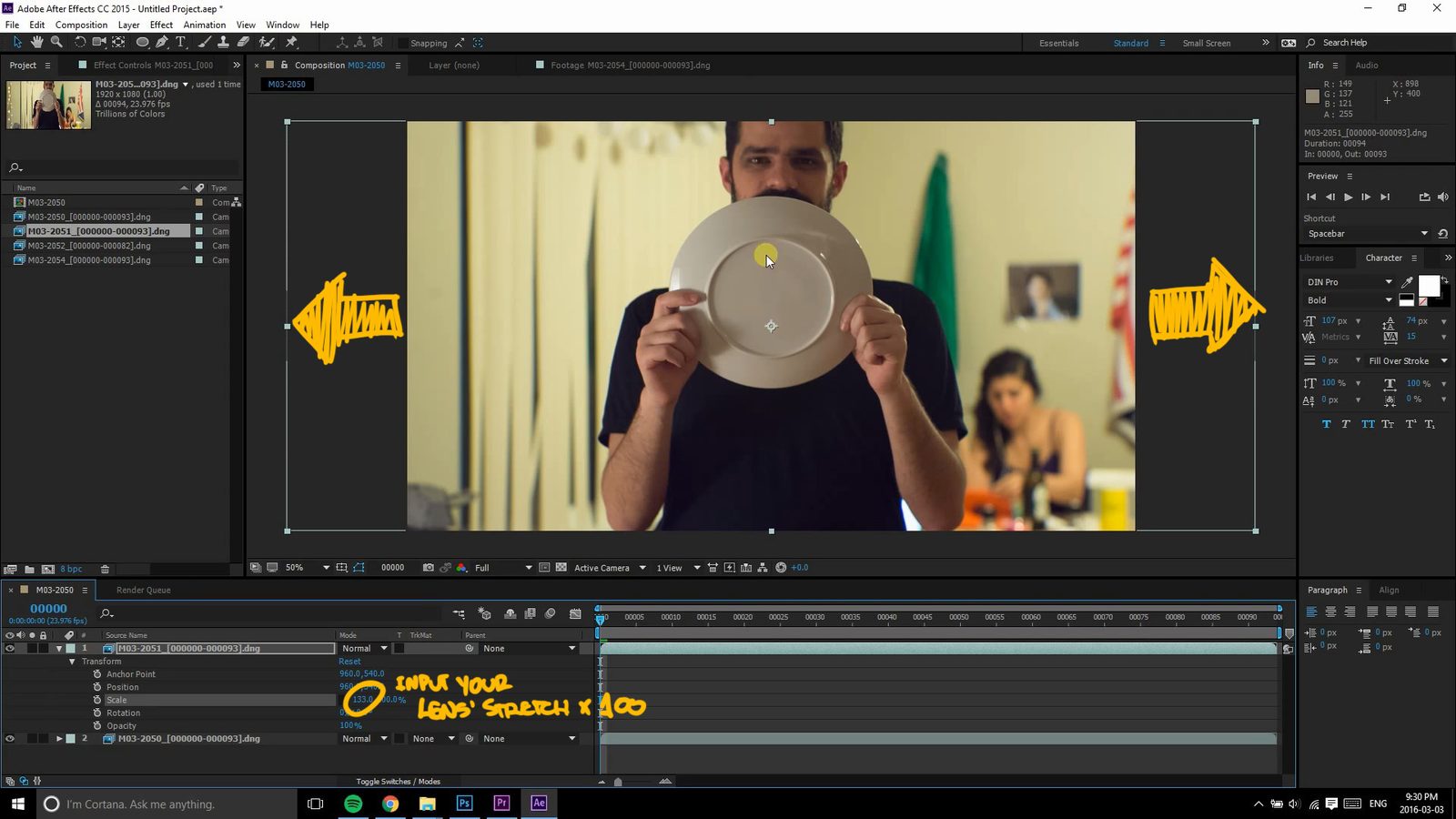
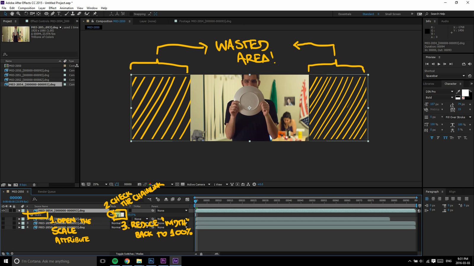
Another way is you just get your squeezed footage file, drop it into a new Composition, go into its Transform attributes, open up Scale and uncheck the chainlink here - this allows you to scale width and height separately. Once that's done, just input stretch factor multiplied by 100 into the width field (it's the first one). 133%, 150% or 200%.


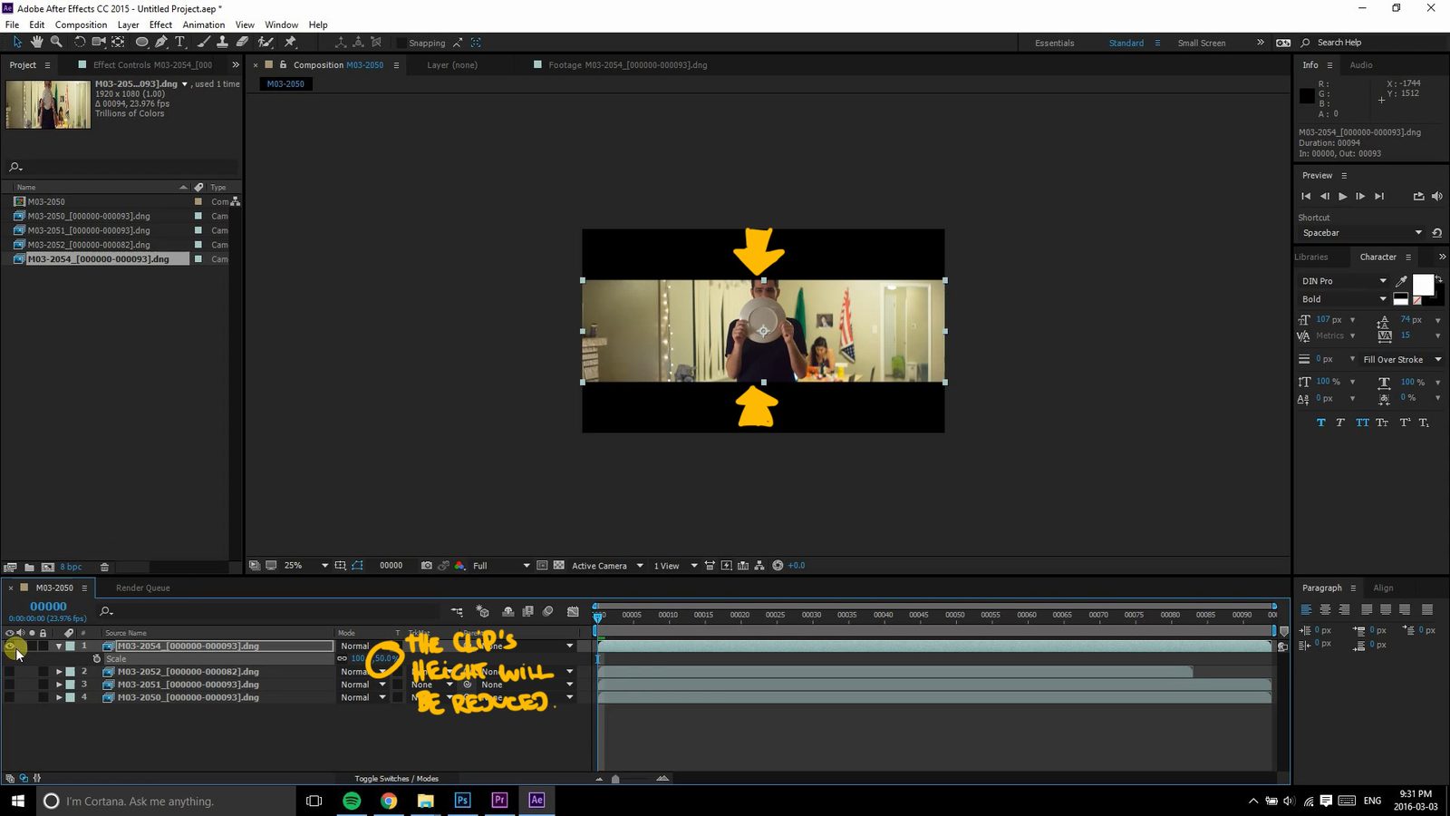
This part here is not exactly necessary, but it's how I like to do it since I always output everything at 1080p: messing with the Scale attribute will give me an image that's larger than my final resolution, so I do the step above as a start, then check the chainlink since this is the new ratio I want between height and width and bring the width back down to 100%. This will reduce the height of the clip and make it fit inside the composition. It also leads to a higher VERTICAL resolution, since the the vertical pixels have been downscaled. Like shooting at 4k to output at 1080p.


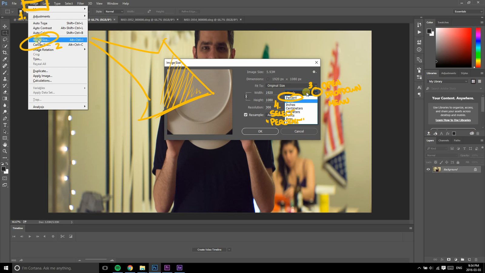
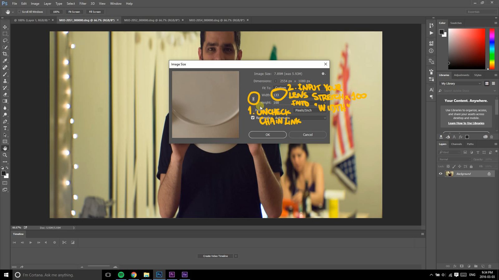
Photoshop is almost like After Effects. I'm gonna use a still picture here, since I still do a lot of anamorphic photographs. To open the Image Size panel go through Image > Image Size in the menus or press Ctrl+Alt+I . Here, select "Percent" as the measurement - it's usually set to "Pixels". You can see a chainlink here too, looks familiar? It's ON by default, so turn it off and, again, input the stretch factor multiplied by 100. 133, 150 or 200, or any other value, if you have a different lens. Hit Ok and enjoy your right looking photo.


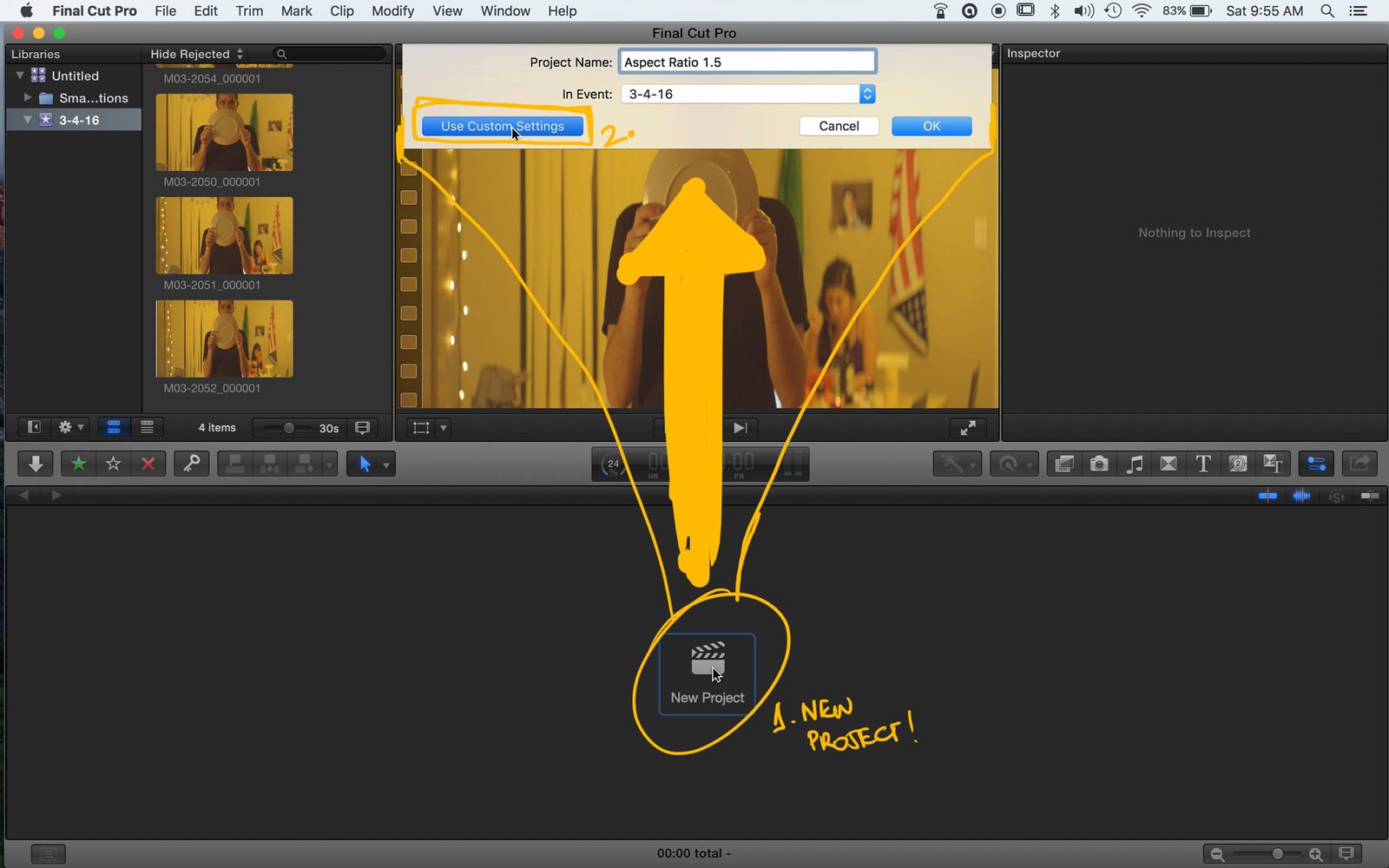
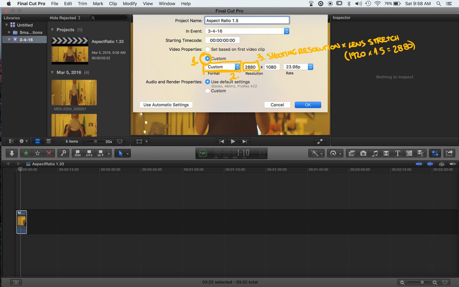
For Final Cut Pro X, import your footage, then create a "New Project" and in the pop-up window, select "Use Custom Settings". Then, in the "Video Properties" section, instead of "Set based on first video clip", set it to "Custom" and pick "Custom" from the dropdown menu. In the first field, regarding the width, input your shooting resolution multiplied by your lens' stretch factor. For example, here I have 1920 multiplied by 1.33x equals 2553. Adjust any other fields that you might want to change, and press "OK".


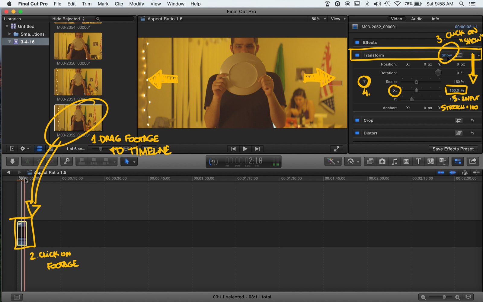
Now drag your clip to the timeline, click on it and go to the "Transform" menu. Click "Show" to expand the properties, then on the little arrow by "Scale" to show both horizontal and vertical scale. Finally, put your lens stretch times a hundred in the X scale, and the footage should be perfectly stretched to fit the project window. The process is exactly the same for other stretch values. For 1.5x, I'm gonna use 2880 by 1080, and then change the X Scale, and for 2x lenses, I'm going with 3840 by 1080, X Scale set to 200%. Then, edit, export, do whatever, with your now good looking footage!

Phew, that was a lot of different options, I hope I was able to help anyone out there having a hard time with the software or the concept of stretching the footage. If you liked this video, you should subscribe to the channel for the upcoming ones and then head on to the blog for a lot more anamorphic content such as the Anamorphic on a Budget guide, the Anamorphic Cookbook and a Calculator that helps you figuring out whether your lens will vignette or not. I also have an awesome t-shirt you can get to help me with this project! Now go out and shoot some pretty pictures for me since I'm stuck at home. Tito Ferradans out for a rainy Sunday.

Anamorphic Day-to-Day

Season 12: Anamorphic Cookbook.

March 9, 2016

I've been working really hard on lensporn lately. This work resulted on these cool looking new banners to represent the twelfth season of this blog and an opening for my upcoming videos, starting in a few weeks from now (I'm still fine tuning everything in place, grading shots and trimming the music so the end piece is not quite done yet).


In the meanwhile, here's the perfect chance for you to grab one of my new t-shirts showing people how crazy you are about anamorphics! It costs around US$30 and you can get it here to proceed with payment! Help me fund this book and all these posts!

Lastly, I'm also selling some of my lenses and gear, so I opened up a yard sale page which will be constantly updated with gear that must go!

Anamorphic

Anamorphic Chop Shop - Corner Pin

March 6, 2016

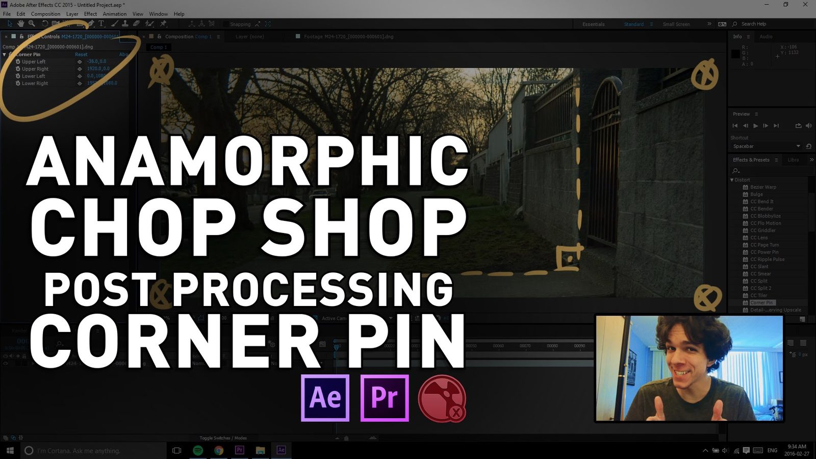
First post-processing tutorial, on how to fix a slightly misaligned shot that you definitely need to include in the edit. Corner pin is a very simple and easy trick to do either in After Effects or Premiere (or Nuke!). Every anamorphic user should be familiar with it.

USEFUL LINKS:

All the RED links on this post are part of eBay's Partner Network, so if you purchase anything through them, you're helping me to keep this project going.

You can support this project on Patreon. Make your contribution and help the Anamorphic Cookbook!

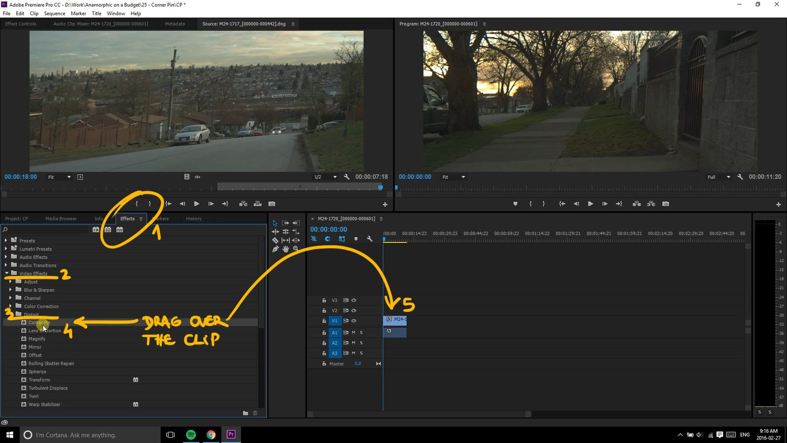
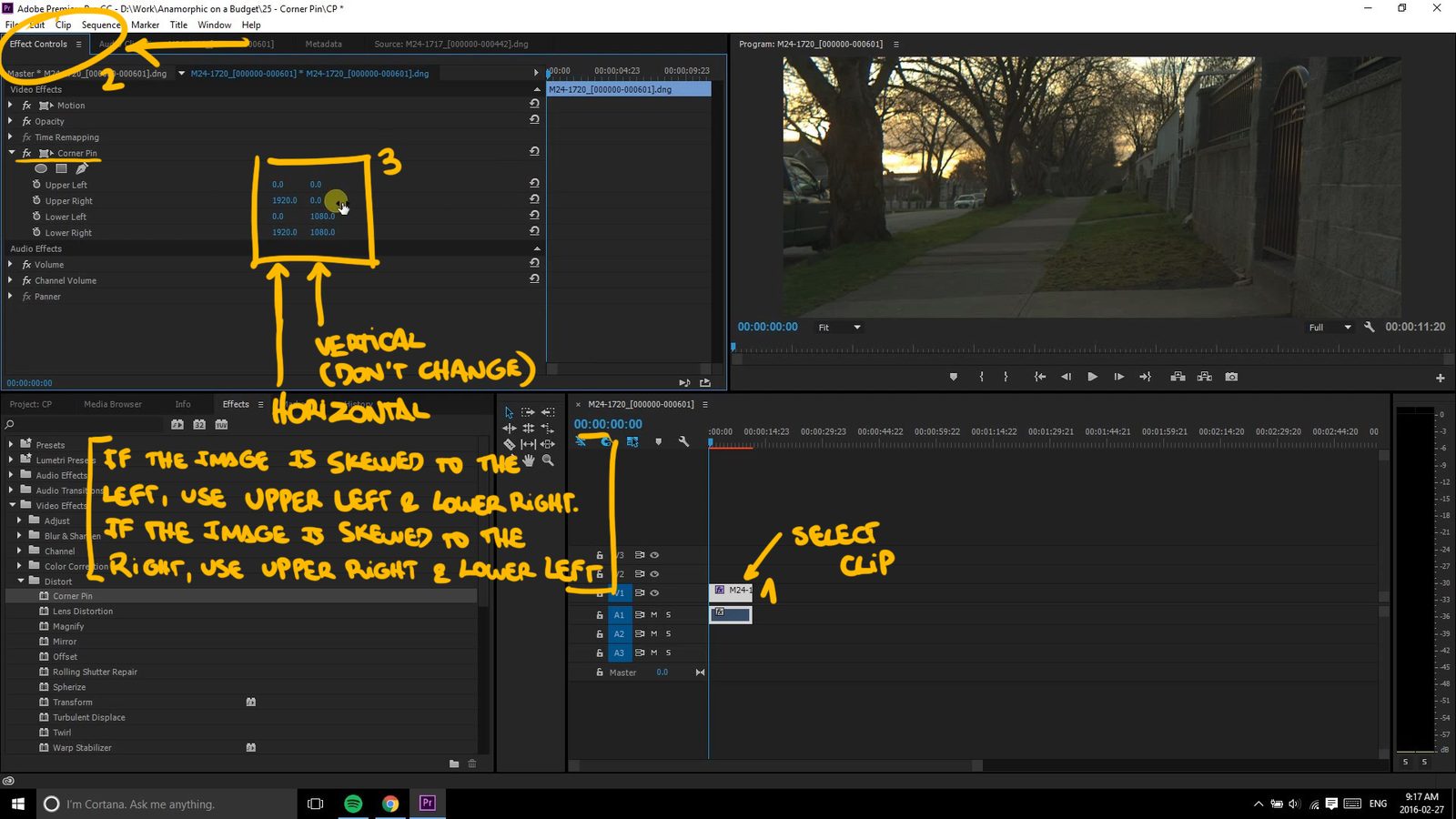
Hey there guys and girls, Tito Ferradans here for the first "post-processing" chop shop! Corner pinning is a very simple and useful trick for that slightly misaligned shot that you'd like to keep. The Corner Pin effect was added to Adobe Premiere in version CS6, just go into the Effects tab and find it under "Distort". Now drag it over the shot you want to fix and go into the Effects tab for that shot. You have two different options now, one is playing with the numbers here, the other is using the mouse to drag the corners manually. For the numbers, the way ones to adjust are based on the direction the image is skewed. If the image is skewed to the left, use the Upper Left and Bottom Right; if the image is skewed to the right, use the Upper Right and Bottom Left. They need to go in opposite directions and always outwards (otherwise you'll have black edges in the frame).


The way I check if it's right is by looking at perpendicular lines in the frame, like buildings and the horizon. If the lens is misaligned, they won't be perpendicular, and that's what you're aiming for. I strongly think this isn't good for fixing flares, since that's likely to mess with every real horizontal line you have in the frame.

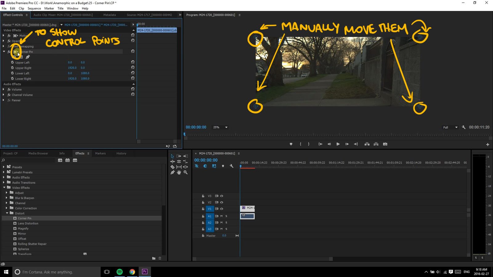
The other option, besides playing with the numbers on the tab is pressing this little square with dots on its corners. This will show the corner pin targets on the footage window and you can drag them at your will until it looks right. Be careful not to change it VERTICALLY, since that will make your footage look weird and even more misaligned. Double check the numbers to make sure the second row hasn't changed values.

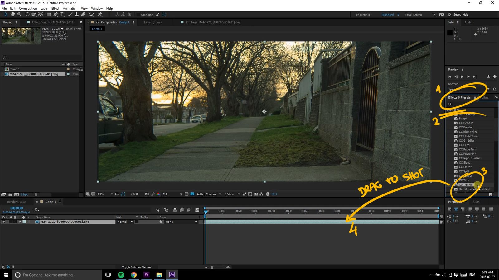
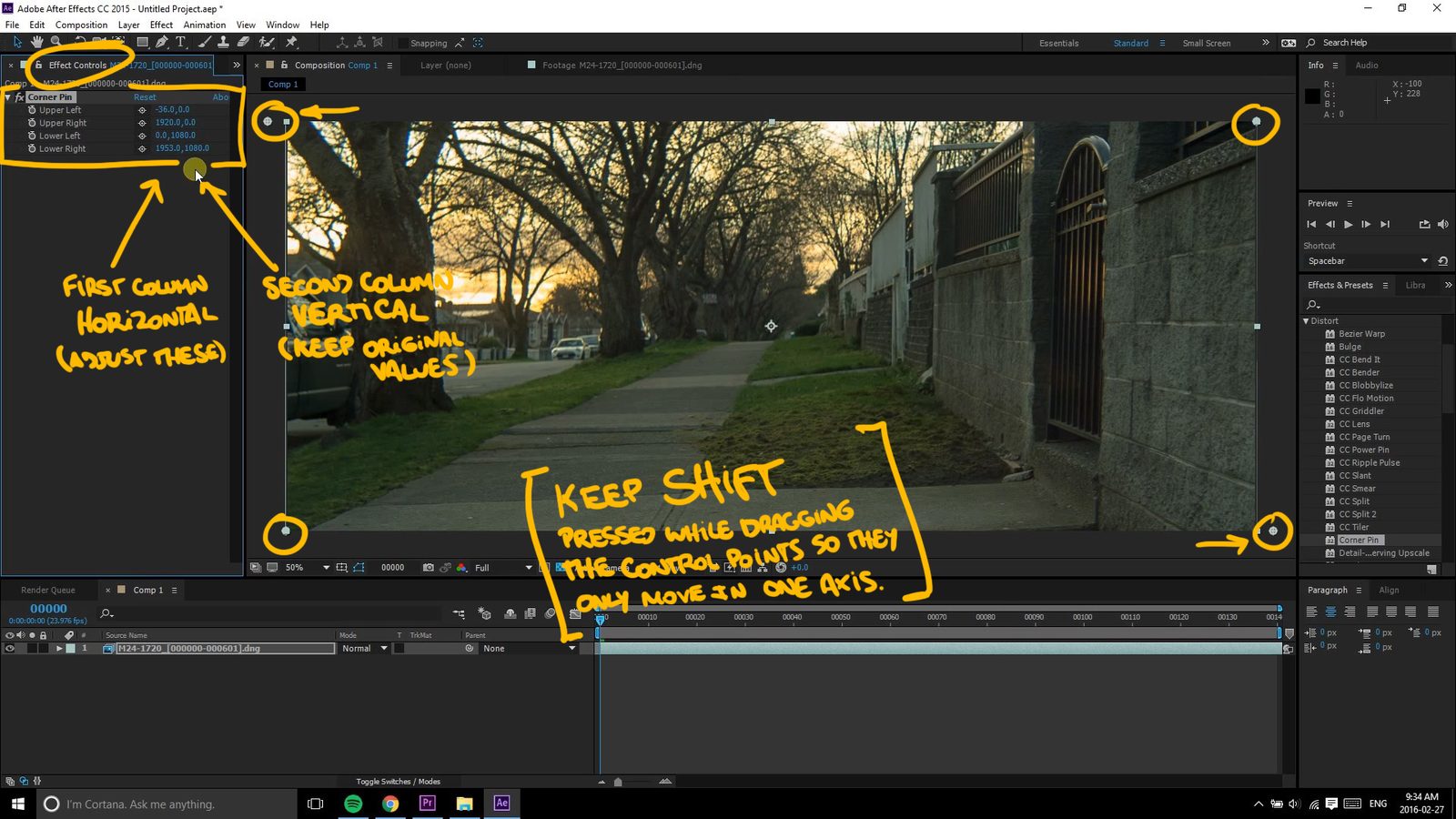
If you prefer working in After Effects, it's almost the same thing. Import your footage, drop it in a composition and drag the Corner Pin effect over it. Here I prefer to just drag the control points instead of playing with the numbers, but that's because I'm super comfortable working in After Effects. I also keep Shift pressed while I drag, to make sure it only moves in one axis, not messing up the footage vertically. If you're not so at home with AE, I strongly recommend keeping an eye on the values to be sure you're not making any mistakes.


I'm gonna reinforce that this cheat just works for footage that is slightly off. If your shot is all messed up, fixing it will either wreck resolution or not look right at all, no matter how much you distort it, so always DOUBLE CHECK ALIGNMENT!

I don't think I need to mention you can do this in Nuke as well since, if you know how to handle Nuke, you don't need a tutorial on Corner Pin!

That's it for this week. Let me know how interesting you find these post-processing tricks and I'll keep working on them! Subscribe now - you really should! - and check my blog for additional articles and videos. Ferradans out.

Anamorphic

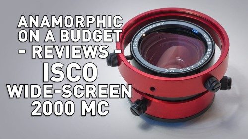
Anamorphic on a Budget - Isco Wide-Screen 2000 MC

February 28, 2016

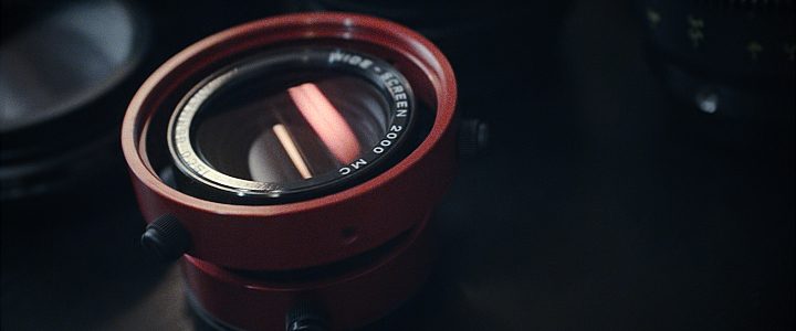
One of the few adapters left in the Isco anamorphic family, the Isco Wide-Screen 2000 is a very compact, light and reliable lens.

USEFUL LINKS:

All the RED links on this post are part of eBay's Partner Network, so if you purchase anything through them, you're helping me to keep this project going.

You can support this project on Patreon. Make your contribution and help the Anamorphic Cookbook!

Anamorphic

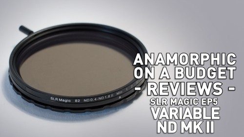
Anamorphic on a Budget - SLR Magic Ep 05 - Variable ND

February 14, 2016

Fifth and last - for now - episode of the SLR Magic series. This one is about their new Variable ND filter. It's a great piece of gear, not only for anamorphic users but anyone looking for control over exposure without loss of image quality.

USEFUL LINKS:

All the RED links on this post are part of eBay's Partner Network, so if you purchase anything through them, you're helping me to keep this project going.

You can support this project on Patreon. Make your contribution and help the Anamorphic Cookbook!

Tito Ferradans checking in for the last episode of the SLR Magic series and also the very first video of 2016! In this episode I'm not talking about anamorphic gear per se but something that can definitely benefit us all. ND filters. Actually, variable NDs or faders. If you haven't thought about it, a variable ND is simply a pair of polarizers stacked against each other and by changing the angle between them you get to cut down light transmission. I'll get to some issues of that a little further ahead, but, for the time being, having variable NDs make life much easier than having a whole bunch of regular NDs.

What are NDs, after all? Well, ND stands for neutral density, which means it's a piece of glass without any color tinge or effect. It follows photographic standards of how transparent it is, so it cuts down the light coming from the world and into the lens in a seamless way without any side effects. NDs are the best way of controlling your depth of field in strong lighting conditions by cutting down the light and allowing you to open up the aperture - while keeping your shutter angle at 180 degrees, unlike I've been doing so far.

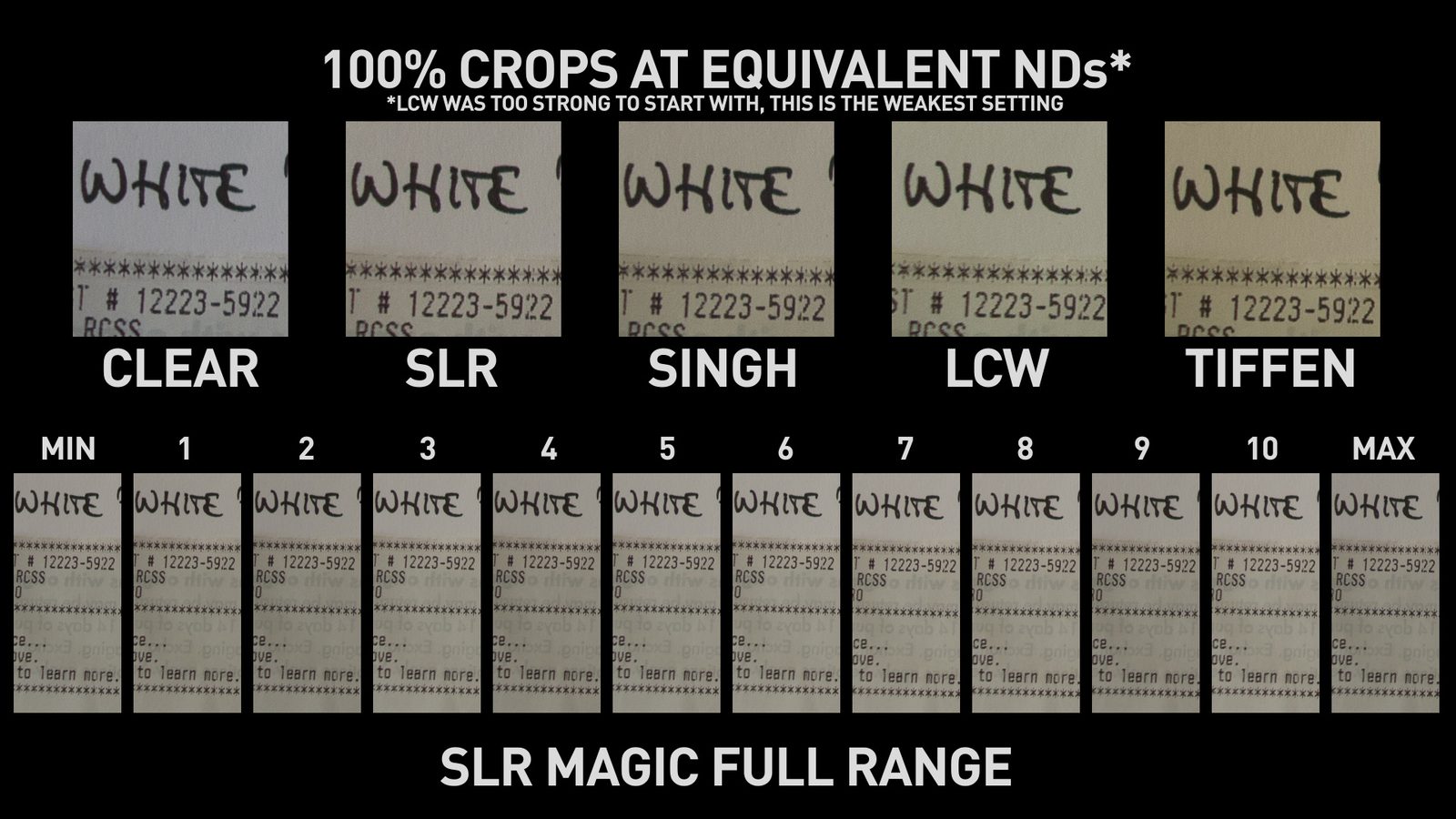
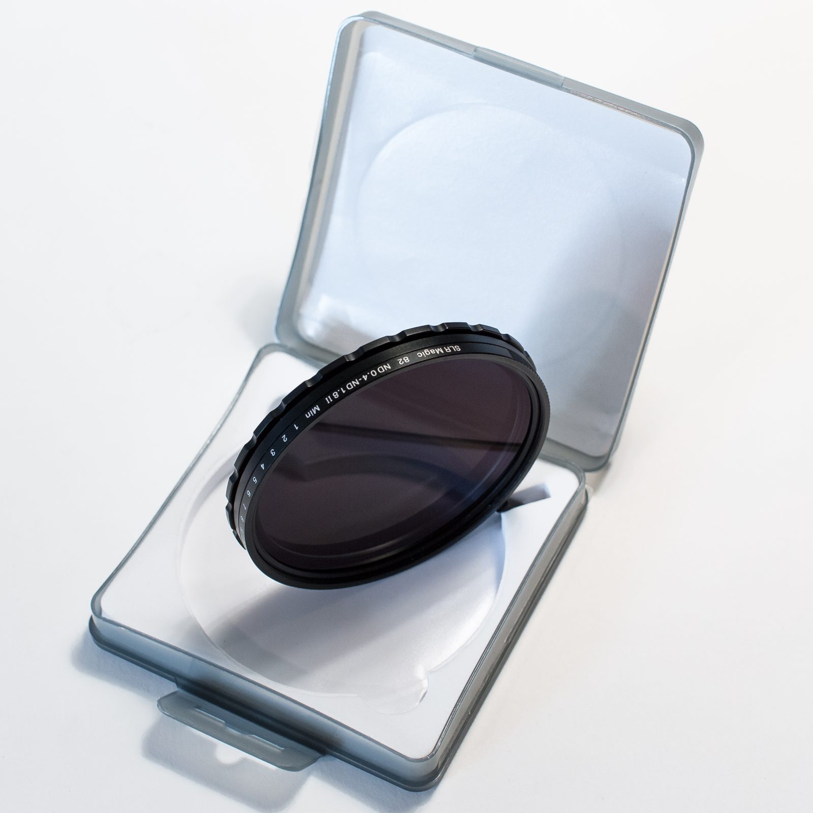
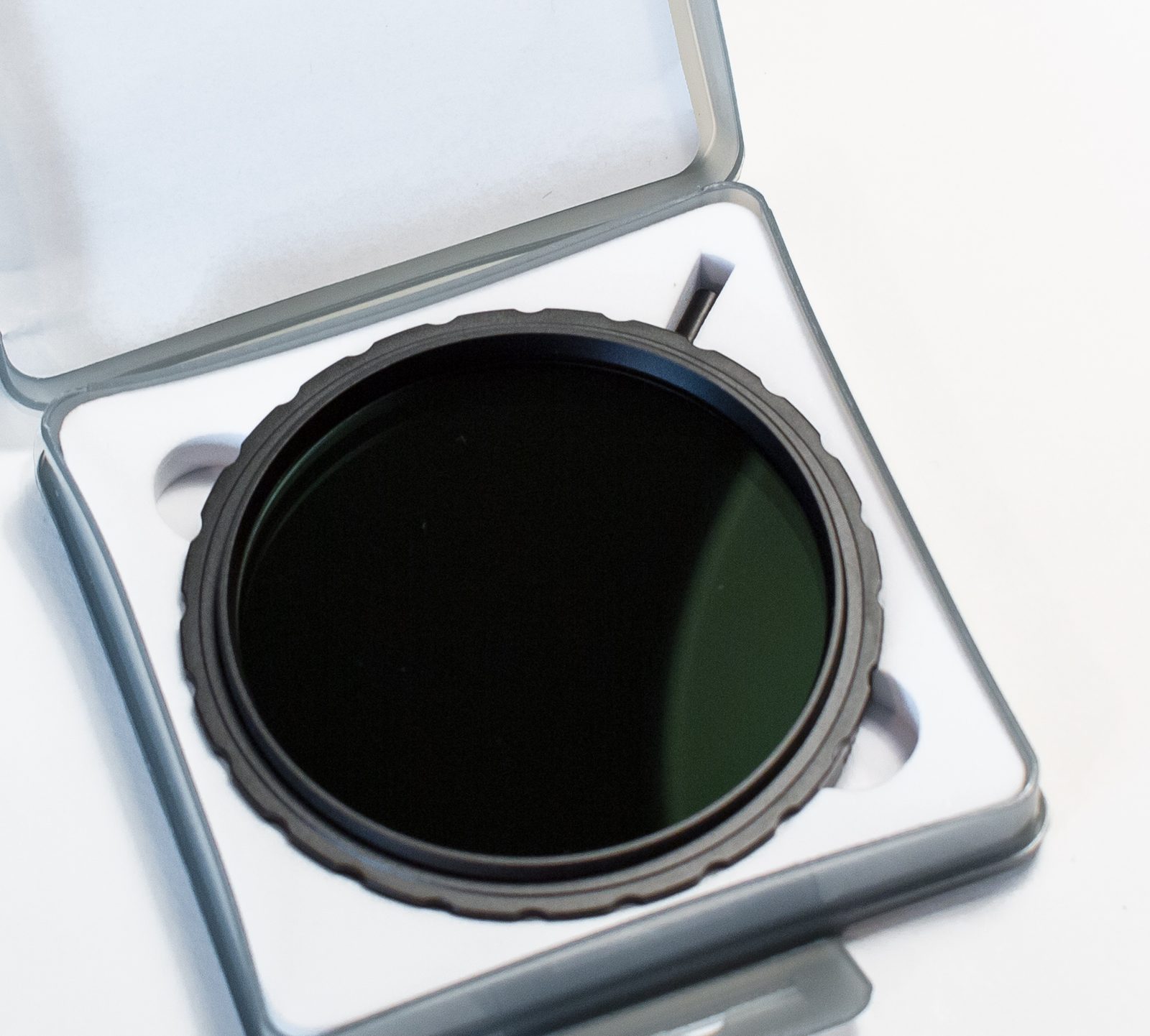
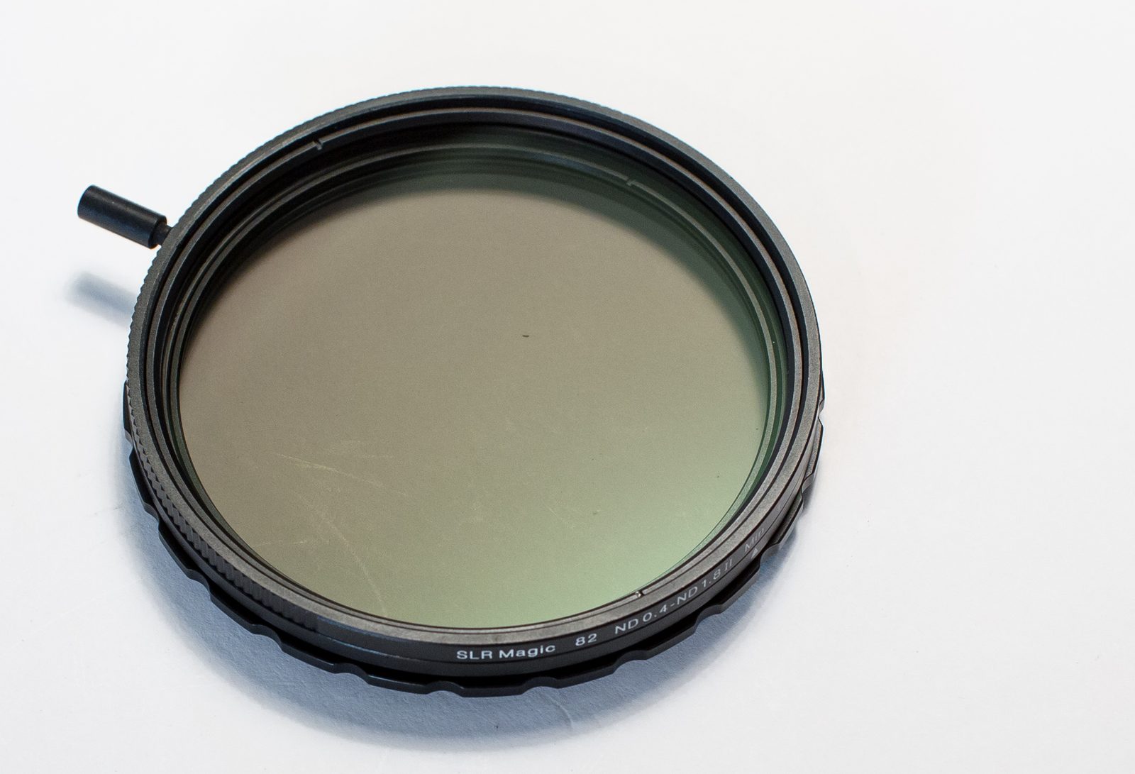
SLR Magic's Variable ND MkII claims to have improved performance over its contenders by keeping color and sharpness under control even at its strongest setting. Here's where that "two polarizers thing" comes into play. When you're twisting the light like that, you're prone to get artifacts. Most strong variable NDs get a LOT of color shifting and loss of sharpness at their strongest position, even the most expensive ones. Rob helped me in this video by lending me his various NDs - Tiffen, Lightcraft Workshop and Singh-Ray. Each of them has different maximum light stopping power. SLR Magic's cuts from 1 1/3 to 6 stops, which isn't a HUGE amount, but it's good enough for most outside shots - if you're not riding your ISO through the roof, that is.

This variable ND has 82mm threads (but you can get a 77mm version too) and markings from 1 to 10 according to its strength at the moment. These are very useful for keeping tabs on how much ND you're applying to your shots. One thing I hadn't seen before is this little lever on the side so you can rotate it without touching the ring - that usually leads to messing up shots and fingers showing up in the frame by accident more frequently than anyone would want.

SLR Magic's Variable ND MkII is available at B&H, Adorama and SLR Magic's website. The 82mm version goes for $189 while the 77mm is $149. Price fits the same range as its competitors - except for the Singh-Ray, which goes for a lot more than that.

One issue that comes up from the combination of polarizers and lenses with rotating front elements is that, even though the exposure won't change, the polarization will and reflections go haywire across the frame as you can see in this shot. Another thing deriving from that is that polarizers cut reflections while standard NDs wouldn't. This is a common issue with any other Variable ND. Once you screw it in, polarization is set for good. SLR Magic's isn't, though. You have this other ring in the back, which operates just like the locking mechanism for their anamorphics, and you can rotate the filter until you're happy with polarization, and then lock it in place! For the following samples I kept the ISO and aperture identical and only made changes to the shutter speed according to the level of ND applied so exposure remained constant. You can also download them or check them at 1080p resolution on flickr!

Sharpness is barely - if any - altered at all, and colors go a little warmer, but not much. You can probably white balance it out in camera, or easily dial it back in post. Ghosting artifacts - quite common with other faders - are also fixed in this one, which highlights how much work they've put into this filter to make it stand out from the crowd by fixing all these flaws inherent to Vari NDs in general.

I was very pleased with this filter - I think it's a great starting point for me that never use any kind of filter, but that might spoil me a bit too! - and it's needless to say I'll keep using it along the next reviews, trying to keep my shutter speeds lower since that was one of the main complaints I heard so far! Rotating front elements are a little annoying, but that only applies to rack focusing, so all my "locked down" shots are easy to do. Thank you very much, SLR Magic and Andrew Chan for providing me with this opportunity, and I look forward to seeing your anamorphic primes soon!

Lastly, if you haven't checked my idea for an in-depth anamorphic guide, you're missing out on it! I need all the help I can to get this done and you can be part of this journey. Subscribe to the channel for the upcoming videos and head to the blog for the rest of the reviews and much more! Tito Ferradans out!